Concept Design for KaiOS Smart Watch
Visual Design Lead / Art Direction / UI / Motion · Mid 2018
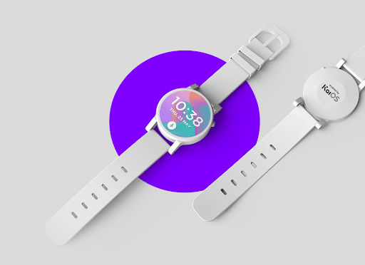
CONCEPT FOR KAIOS SMART WATCH
This wearable watch project was initiated by KaiOS's U.S. partner, AT&T; the requirement of this product needs to fit a wide range of users, such as kids, sports, and elders. The design also needs to apply to both touch and non-touch display hardware. Our UX team spent two weeks finishing the pitch deck, including the design concept, high-level interaction design, and visual design.
My contributions to this project were: concept development, storyboard, launcher design, UI components, and motion design, and led 2 visual designers in Taipei and 1 visual designer in Manaus, Brazil, responsible for the UI design.
Role
- Visual Design Lead
- UI Designer
- Motion Designer
Team
- UX Designer
- UI Designer
- Product Manager
Duration
- May 2018 to Jul 2016
- 3 mo.
DESIGN THINKING
- A Simple, Essential
- Yet Efficient Smart Watch Design
WHO ARE THE USERS?

DESIGN OBJECTIVE
Simple Navigation
A design is easy to use and learn so that users can easily operate the device.
Personalize for Users
A design is flexible enough to allow users to customize the launcher to fulfill their needs.
Speedy Action
A design that does not require many steps to get things done.
Clear Visual
A user interface design that users can browse and read clearly on a tiny watch display.


FEATURES
Voice Assistant
Use voice commands and voice typing
Communication
Make and receive phone calls
Training
Track workouts and activities
Health
Monitor heart rate and gather fitness data
Location Monitor
Track child's location for safety
Reminder
Set a reminder to stay on track with tasks






WEARABLE OS STUDIES
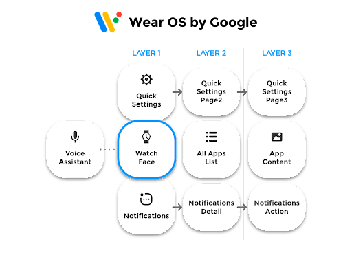
Wear OS by Google
- Reaching an app/action requires access to more than 2+ layers.
- Complicated operation in Quick Settings and Notifications.
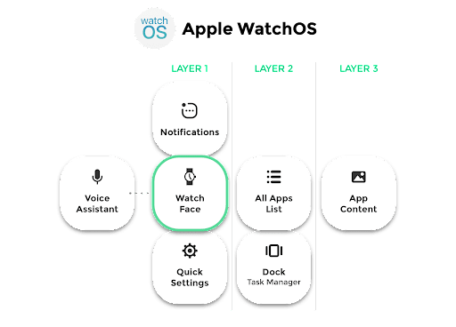
Apple WatchOS
- Reaching an app/action requires access to more than 2+ layers.
- Dock and All Apps List are confusing.
KAIOS WEARABLE UX
NAVIGATION MODEL
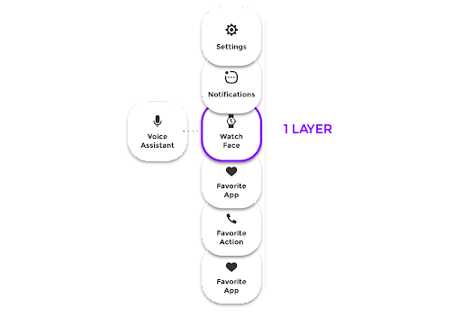
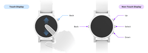
- One layer to reach an app/action by swiping up or down on the touch screen or pressing up or down the hardware key.
- Personalization of most used apps and actions on the launcher.
A SINGLE-LAYER DESIGN
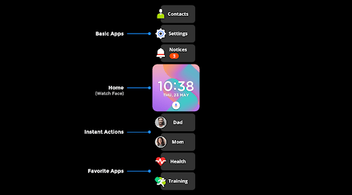
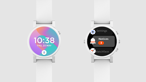
We keep the home(watch face), basic apps, instant actions, and favorite apps on the launcher in a single layer so that users can easily access their most-used apps or actions in a vertical scroll list.
SCREEN SHAPES
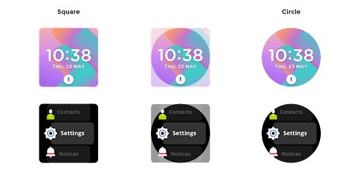
The user interface is compatible with different shapes of screens, whether square or circle.
HARDWARE COMPATIBILITY
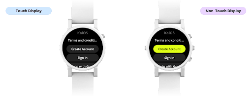
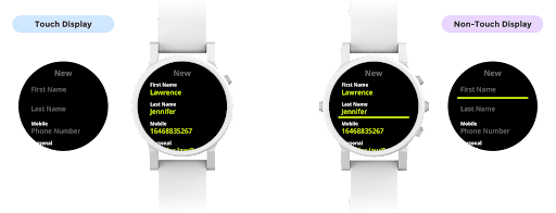
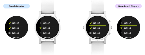
One design adopts both touch and non-touch displays.
LAUNCHER NAVIGATION IN MOTION
Swiping up or down on the touch screen or pressing up or down the hardware key to switch a card (an app or an action) on the launcher.
VISUAL DIRECTION
Modern
Build a modern UI in mind that is easy to use and engage with for users.
Minimalist
Build a minimalist interface that loads fast and requires fewer resources to carry out in less time.
Depth
Create a sense of depth that overlaps elements and objects to emphasize the visual hierarchy.
Contrast
Using contrast in a balanced way to help organize the design and establish a hierarchy
UI COMPONENTS
LIST
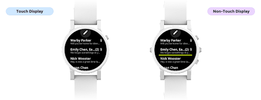
For the Non-touch version, the elements (secondary text and on/off switch) will show when it's being selected.
HEADER BUTTON
The header can display the page title and an action button.
BUTTON
INPUT
OPTION MENU
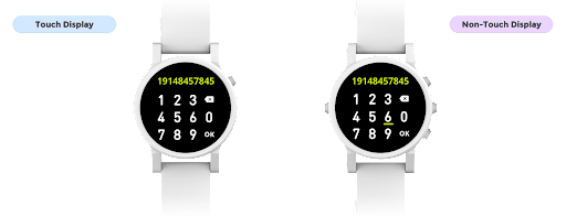
NUMBER KEYPAD
For the Non-touch version, press the up or down hardware key to switch a number or other key among three rows.
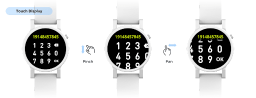
MAGNIFYING EFFECT ON NUMBER KEYPAD
Dail numbers on a watch size display isn't easy. For the Touch version, users can use the pinch zoom in/out gesture to change the keypad size and the pan gesture to scroll the view vertically or horizontally.
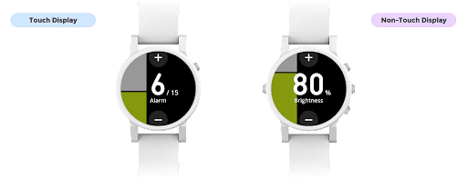
SLIDER
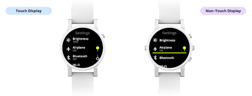
On the Touch version, users can tap the top and bottom buttons on the screen to adjust the level. And for the Non-touch version, users can press the up and down hardware keys.
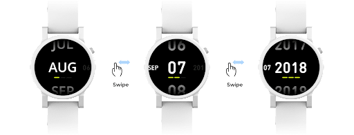
DATE PICKER
Use the horizontal swipe gesture to switch among the columns (month, day, and year) and the vertical scroll to adjust the value in each column.
DIALOG
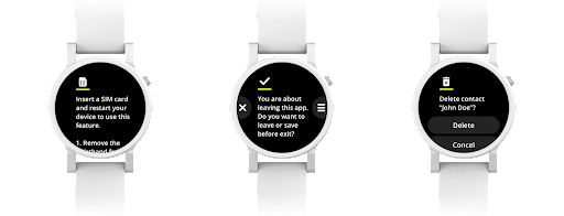
The dialog can appear with action buttons or without buttons. The right and left edge buttons are used for an action that can display the icon, and the list text buttons can display more than two actions.
PROGRESS BAR
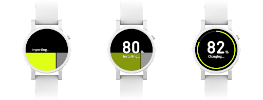
There are two types of progress: linear progress and circular progress, and both support determinate and indeterminate states.
NOTIFICATIONS
VOICE ASSISTANT
COLOR
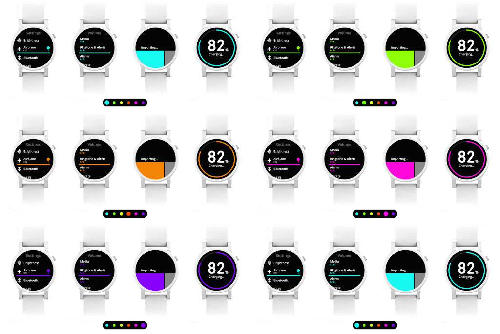
The reason why I chose Neon color is because it's widely used in the fashion industry; it has made its way into sporty and formal high-end clothing manufactured by major designers. The neon color gets noticed, eye-popping, and attracts attention immediately. I applied neon as the primary color, which appeared as part of the color element in highlight and press states within the app.
WATCH FACES
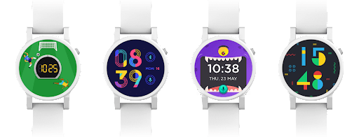
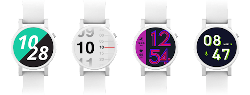
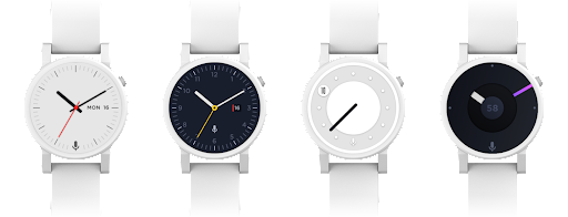
The watch face set, with more than 20+ styles, was designed and crafted by the visual designers, Aaron Sung and Leticia Cavalcante.
KIDS
SPORTS
UNISEX