YADEA E-SCOOTER APP
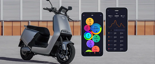
Yadea is a well-known electric scooter company based in China. It is one of the leading manufacturers and sellers of electric two-wheelers, including electric scooters and motorcycles. I had the opportunity to contribute to their app redesign project, catering to both the iOS and Android platforms on a freelance basis.
My contributions to this project were UI design, and prototype. I worked collaboratively with Yadea's UX Designer, PM and developers in Shanghai, China, to ensure the successful launch of products in Greater China.
Role
- UI Designer
Team
- UX Designer
- Product Manager
- Front-end Engineer
Duration
- Feb 2018 to Jun 2018
- 5 mo.
CHALLENGES
The current app is experiencing low usage, primarily due to a lack of user awareness regarding the services it offers. Many users do not perceive the app as necessary because they are unaware of the content of services it provides.
GOAL
Redesign the app to solve current user pain points and enhance user experience by providing supplementary services within the app for daily use. Our focus is on providing features that allow users to conveniently locate scooters, easily start and power off the scooter, perform comprehensive scooter diagnostics, and efficiently schedule repairs at authorized service centers, and so on.
By doing so, we aim to encourage users to make full use of the app's services, resulting in increased user engagement and ensuring that they derive maximum benefits from our platform.
APP ANALYSIS
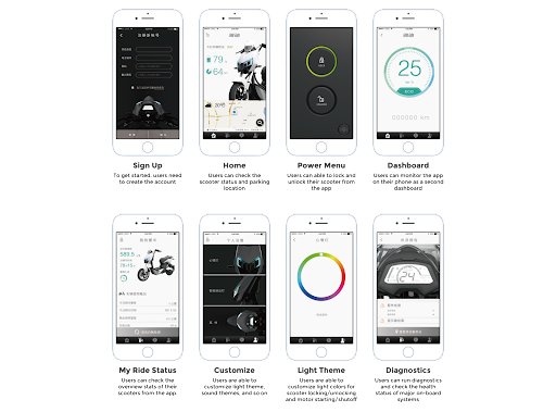
It was essential for me first to do an in-depth analysis of the app. I wanted to understand the different functionalities and the app's overall architecture and navigation.
APP AUDIT
Before involving the UX designer, I did an app audit to analyze and fully understand its features and usability. Throughout this process, I was able to identify some apparent usability issues and pain points from my perspective. However, the downside was I was working remotely outside of China, which prevented me from conducting user interviews and tests to validate my observations.
DEFINING THE PROBLEM
After conducting an analysis, I have identified several areas that can be improved in the current design:
- The current design fails to incorporate the brand color, orange, as an accent color to highlight key elements of the UI.
- The entire UI lacks visual hierarchy, and as a result, the UI elements such as buttons, input or tabs do not appear clickable to users.
- The theme colors on each page are inconsistent, with some pages adopting a dark theme while the majority of the pages maintain a light theme.
These identified issues require attention and improvements to enhance the overall user experience.
VISUAL DESIGN
VISUAL EXPLORATION
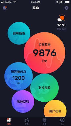
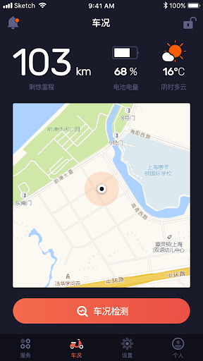
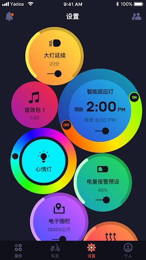
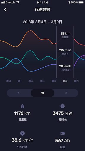
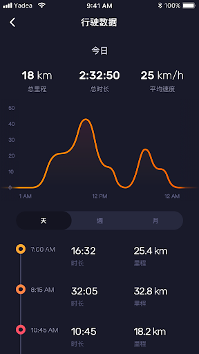
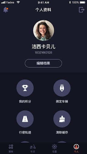
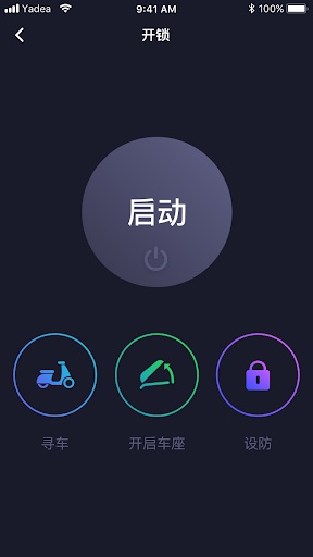
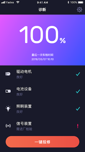
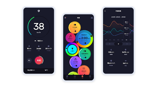
I implemented a circular shape for the majority of clickable UI elements. I incorporated the brand color of orange as an accent color consistently across all pages in the dark theme design. To enhance the visual appeal, I introduced gradient colors, contributing to a more sophisticated design.

KEY SCREENS
- Services
- My Ride
- Settings
- Activity - Week View
- Activity - Day View
- Account
- Controls
- Diagnostic - Completed
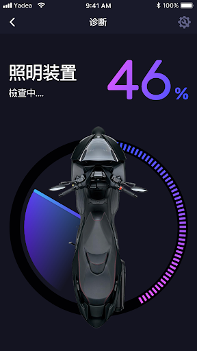
- Diagnostic - Checking
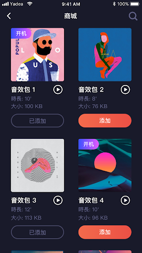
- Yadea Store
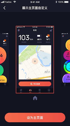
- Home Picker
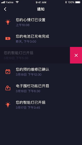
- Notifications
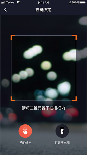
- QR Code Scanner
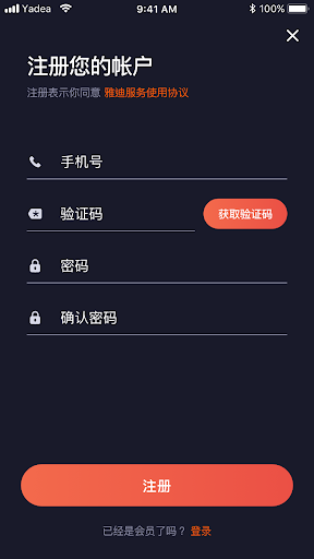
- Sign Up
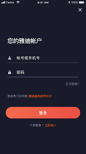
- Log in